Web development is always evolving — that’s part of what makes it so great. As we embrace the new, we move further away from the old. But sometimes I like to reminisce about the old, because a lot of it was hilariously awful. So here are 8 terrible things I recall from my early years as a web developer.
1. Web Safe Colors
Modern displays have no problems rendering 6-digit hex-based color values (#c2255c, for example). The math works out to a vast spectrum of about 16.8 million colors. But this wasn’t always the case.
In the early days of the web, many displays could only handle 256 colors. On top of that, different operating systems diverged on many of those colors. The end result was a palette of only 216 “web safe” colors that you could rely on. If you tried to use colors outside of this palette, you risked having your colors skewed or dithered.
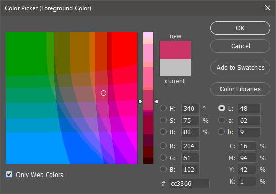
Ever wonder what that “Only Web Colors” checkbox in Photoshop’s color picker is for? Now you know. I’m surprised it’s still there, but I guess some people still use it.
2. Rounded Corners
Rounded corners are ridiculously easy thanks to border-radius.
border-radius: 10px;Before border-radius, rounded corners were an absolute pain. The most popular method for achieving them was to create images for each rounded corner, then assemble them together in a carefully crafted 9-cell table.

Adjusting colors or the size of the corners meant going back into Photoshop and making a new set of images. And the markup needed for the 9-cell table was pretty hefty. All of this to do something that we can now do in mere seconds with border-radius.
3. Images for Everything
Using images for rounded corners was just the beginning. Shadows and gradients were not yet supported via CSS, so you had to save those as images, too. Want to use a fancy font? Web fonts weren’t a thing yet, so you had to save an image of text (cringe).
In extreme cases, web developers would just give up trying to create tricky layouts with HTML and resort to saving an image of the layout, text and all. They would then use an image map to overlay clickable regions for links on the “layout”.
We’ve come a long way since then. Things like CSS filters and SVG are letting us render more and more impressive things directly in the browser with relative ease. Still, I have a hunch that the best is yet to come.
4. Single-Browser Compatibility
Web standards are the guardian angels of the web. They guide browsers towards common ground, so web developers spend less time coding for various cases of divergent behavior. Even when browsers fail to correctly implement a web standard, at least we have a common language with which to call it out and say “this is wrong”.
Before web standards, it was a mess. You basically had IE and Netscape, but they disagreed on so much. Huge swaths of JavaScript were wrapped in if/else statements to target one browser or the other with code that only worked in that browser. Even HTML was browser-specific (for example, <layer> was specific to Netscape).
It was so bad that some web developers gave up trying to serve the same site to both browsers. Instead, they’d create 2 fully independent versions of the site, one for IE and one for Netscape, and redirect visitors accordingly.

Others still would just give up on cross-browser compatibility. They’d pick one browser and just tell their visitors to use it, usually in the form of a “best viewed with _____” badge on their site. I’d consider these to be badges of shame in today’s web, but at certain points in browser history, it was hard to argue. When IE6 had 95% market share, was the other 5% worth the effort?
5. Table Layouts
Getting layouts just right takes practice, but thankfully CSS has matured to the point where we have plenty of techniques to help out. Of course, flex and grid haven’t always been around. And even float and position were very buggy in the early days. So we relied on <table>.
When I say relied on, I mean really relied on. So many tables. Tables nested within tables nested within tables. Despite the sea of <table> and <tr> and <td>, this was accepted by most web developers, simply because there were no dependable alternatives. Even as alternatives started to appear, browser quirks made them difficult to embrace, a sentiment bluntly expressed by a site called Give Up and Use Tables.
6. Spacer GIFs
This is one of my favorites. Controlling the width and height of pieces of content, as well as the whitespace between them, was a finicky endeavor — especially with the previously mentioned table-based layouts. Browsers took width and height values set on table cells as mere suggestions, happily ignoring them.
The solution was to use a spacer GIF — a GIF that was nothing more than a single transparent pixel. This image could be dropped wherever needed, with the desired width and height values set on it, to force browsers to make room for it.
For example, if you wanted a table cell that was never less than 200px wide, you’d do this.
<td>
  This is web development!
  <img src="spacer.gif" width="200" height="1">
</td>
7. The Box Model Hack
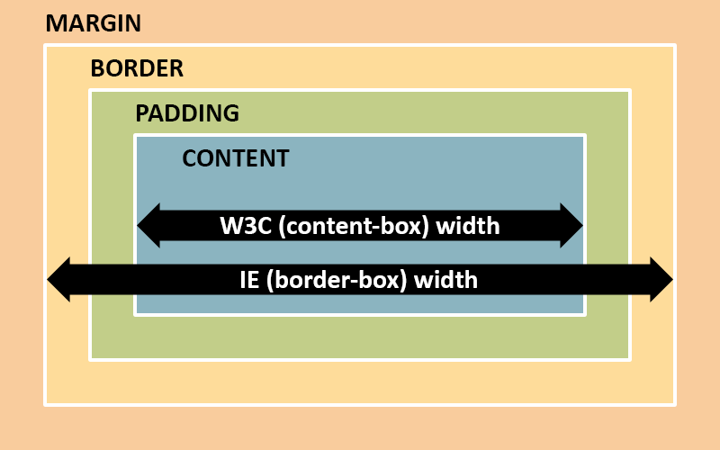
Modern browsers are generally really good at following web standards. Yep, I said it. There are still gripes to be had, but they’re nothing compared to what we’ve put up with in the past. Case in point: box sizing. When determining the width of something, Internet Explorer (and Netscape) included border and padding. Other browsers followed the W3C recommended spec of not including border and padding.
For example, take these styles.
div {
  width: 100px;
  padding: 10px;
  border: 1px solid red;
}
In IE, you’d see a 100px wide red box. In Chrome, you’d see a 122px (100 + 10 * 2 + 1 * 2) wide red box. As you can imagine, having divergent behavior with something as fundamental as width and height was catastrophic to cross-browser compatibility.
A gentleman by the name of Tantek Çelik came up with a genius/terrible CSS hack to eliminate the divergent behavior. It abused a CSS parsing bug in IE to hide a second width declaration that only non-IE browsers would see. This allowed you to specify separate CSS widths that converged to the same rendered width across browsers.
div {
  width: 122px; /* all browsers see this */
  padding: 10px;
  border: 1px solid red;
  voice-family: "\"}\""; /* IE would give up here */
  voice-family: inherit;
  width: 100px; /* non-IE browsers see this corrected value */
}
Personally, I hated this hack and avoided it like the plague.
The funny thing is, IE’s approach is now widely accepted as being the sensible one. Fortunately, modern CSS makes it really easy to opt-in to IE’s box model, and it’s something you see declared globally at the top of many stylesheets: box-sizing: border-box.
8. Toxic SEO
When search engines first surfaced, they did this crazy thing where they actually believed people were being honest. If such a thing was true, it wasn’t true for long. This led webmasters (as they were often called) to do ridiculous things to trick search engines, visitors be damned.

One example is keyword stuffing — filling pages with literally hundreds of keywords for search engines to pick up. These would often be hidden, using techniques such as black text on a black background. A lot of times these keywords would be an unapologetic list of popular search terms (like “sex”) that had nothing to do with the content.
Doorway pages were also popular. These were standalone pages that served solely as search engine bait. Their purpose was to clog the top spots in search results, then link or redirect visitors to the real site.
Fortunately, these hacks don’t work anymore. Search engines have come a long way towards discouraging shady behavior and encouraging actual content. Of course, the war isn’t over, but the landscape is a lot more human-friendly.
Things Keep Progressing
Most of the things I’ve shared are now dead practices. At the very least, I would consider all of them to be bad practices in the modern web. But as fun as it is to look back and laugh, it’s important to have a sense of context. It was a different world (wide web) back then and we did what was right for the time. I fully expect to look back at our current practices one day and find them just as ridiculous.
And that’s how we’ll know we’ve progressed.