Let’s say you want to make this button using CSS (enlarged to show texture):
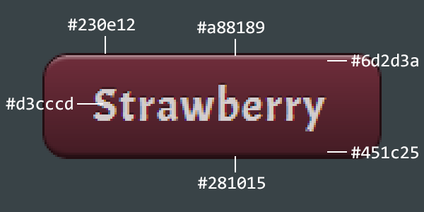
Generally speaking, it’s red. Yep. But thanks to gradients, shadows, and highlights, it has many shades of red. Still, recreating this button in CSS is totally doable. It’s not rocket surgery.
The Problem
Alright, so let’s say you take the direct approach and whip up the CSS for this button using all the colors specified above. Done! But wait, you probably want to add a hover state that’s a bit lighter. And an active state that flips the gradient to make it look pressed. And then you need other color variants of this button to use across the site. Suddenly, you’re juggling way too many color values. And hope your designer never asks you to tweak any colors, because all of this is a maintenance nightmare.
Let’s Mention Sass
I would be remiss if I didn’t mention Sass. It supports color variables and offers a ton of great functions for relative tweaking of colors. This could certainly help in this situation, but it’s not the direction I’m going in with this blog post.
The Single Color Solution
Specifying all those color values sucks. What if we could reduce all of it to a single background color, using carefully crafted (and reusable) CSS to paint the gradients, shadows, and highlights relative to that single color? Yep, that’s what we’re doing.
The trick is to use various transparency effects with pure white or pure black. Using semi-transparent colors is easy:
color: rgba(0, 0, 0, 0.4);      /* semi-transparent black */
color: rgba(255, 255, 255, 0.4) /* semi-transparent white */
This lets you produce lighter/darker shades of the background color without hardcoding them. We can specify the background gradient to go from “completely transparent” to “semi-transparent black”, so when it overlays the background color it looks just as if we hardcoded two shades of that color.
For the hover state, we’ll use the gradient animation trick I posted about last time, shifting the transparency gradient up and down. For the pressed state, we’ll reverse the transparency gradient.
With all our styles in place, here is how we create 5 color variants of this button:
button:nth-child(1) { background-color: #773c92; }
button:nth-child(2) { background-color: #3c6492; }
button:nth-child(3) { background-color: #58923c; }
button:nth-child(4) { background-color: #926a3c; }
button:nth-child(5) { background-color: #923c4e; }
That’s it. Super maintainable.
Here’s a demo of what they look like (click on the CSS tab to see the styles used):
See the Pen Maintainable Buttons by Will Boyd (@lonekorean) on CodePen.