The ::before and ::after pseudo-elements are incredibly versatile tools in the CSS toolkit. Understanding them can help you craft practical CSS to solve all sorts of situations. Or you can take things further and use them to create impressive feats of CSS trickery.
This article starts on the ground floor, explaining these pseudo-elements and how to use them. We’ll dive into saucier topics as the article progresses. We’ll also be talking about the CSS content property a lot, since it’s very much related.

What Are They?
In CSS, ::before and ::after are keywords you can add to a selector to create pseudo-elements. The pseudo-elements are inserted into the element(s) matched by the selector, either before or after any content within.
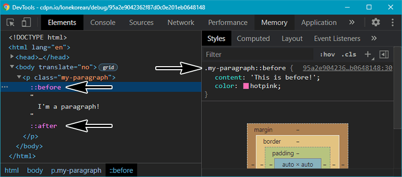
It’s probably easiest to show an example. Take the following HTML and CSS.
<p class="my-paragraph">
  I'm a paragraph!
</p>
.my-paragraph {
padding: 20px;
border: 4px dashed lightgray;
}
.my-paragraph::before {
content: 'This is before!';
color: hotpink;
}
.my-paragraph::after {
content: 'This is after!';
color: steelblue;
}Here’s the result.
See the Pen ::before and ::after Pseudo-Elements by Will Boyd (@lonekorean) on CodePen.
If you take a peak at the dev tools, you’ll see ::before and ::after inside of the <p> element. You can click on them to view or edit their styles, just like any other element.
We’ve just used CSS to create elements and content that didn’t exist in the HTML. This is crazy powerful!
Decorative Lines Heading
::before and ::after are great for adding decoration. Check out this heading with decorative lines.
See the Pen Decorative Lines Heading by Will Boyd (@lonekorean) on CodePen.
The HTML is just a single <h1> tag.
<h1>Elegant Heading</h1>The double lines on either side are handled entirely in CSS.
h1 {
  display: grid;
  grid-template-columns: minmax(50px, 1fr) auto minmax(50px, 1fr);
  align-items: center;
  text-align: center;
  gap: 40px;
}

h1::before, h1::after {
  content: '';
  border-top: 6px double;
}
This inserts pseudo-elements before and after the heading text. Their content is set to '', because we don’t actually want any content, we just want elements there so we can apply double borders to them to create the lines.
Now’s a good time to mention that the content property is required for a pseudo-element to be created, but as you see here, it’s fine to set it to '' (empty string).
The layout is achieved by turning the <h1> element into 3 columns. The left and right columns are the double lines, both with a width of minmax(50px, 1fr), meaning they’ll always have matching widths no smaller than 50px. The heading text is neatly centered in the middle column.
Decorative Ribbon Heading
Alright, let’s take this concept further. Here’s a ribbon heading.
See the Pen Decorative Ribbon Heading by Will Boyd (@lonekorean) on CodePen.
Once again, all we need is a single <h1> tag in the HTML.
<h1>Ribbon Heading</h1>The CSS takes it from there.
h1 {
  position: relative;
  margin: 0 auto 20px;
  padding: 10px 40px;
  text-align: center;
  background-color: #875e46;
}

h1::before, h1::after {
  content: '';
  width: 80px;
  height: 100%;
  background-color: #724b34;

  /* position ribbon ends behind and slightly lower */
  position: absolute;
  z-index: -1;
  top: 20px;

  /* clip ribbon end shape */
  clip-path: polygon(0 0, 100% 0, 100% 100%, 0 100%, 25% 50%);

  /* draw and position the folded ribbon bit */
  background-image: linear-gradient(45deg, transparent 50%, #5d3922 50%);
  background-size: 20px 20px;
  background-repeat: no-repeat;
  background-position: bottom right;
}

h1::before {
  left: -60px;
}

h1::after {
  right: -60px;
  transform: scaleX(-1); /* flip horizontally */
}
This time, we’re using absolute positioning to place the pseudo-elements. The left ribbon end is created with ::before and the right is created with ::after. The CSS draws both of them together with shared styles, facing the same direction, then flips h1::after with transform: scaleX(-1).
The shape of the ribbon ends is achieved with clip-path. The folded ribbon bits are little background-image triangles drawn with linear-gradient() and carefully positioned in the bottom inner corners.
Working with Quotes
Let’s get back to setting content on ::before and ::after to something other than an empty string, because there’s some interesting stuff you can do there.
content can be set to the special values open-quote and close-quote. Doing so will insert open/close quotes appropriate for the current language. Styling <blockquote> is a good use case for this.
<blockquote lang="en">
  Hello! I am a block quote in English. Check out how the quotation marks are automatically added around me!
</blockquote>

<blockquote lang="fr">
  Salut ! Je suis une citation en français. Je ne connais pas le français, alors j’ai demandé à quelqu’un sur Twitter de le traduire !
</blockquote>
blockquote::before {
content: open-quote;
}
blockquote::after {
content: close-quote;
}
blockquote::before, blockquote::after {
opacity: 0.25;
padding: 0 10px;
font-size: 3em;
}
blockquote {
display: flex;
justify-content: space-between;
align-items: center;
margin: 20px;
padding: 20px 10px;
border-radius: 10px;
background-color: #e5ddcb;
}Now we have automatic stylish quotes for <blockquote>.
See the Pen Stylish Blockquotes by Will Boyd (@lonekorean) on CodePen.
Unlike <blockquote>, the <q> tag (inline quotation) shows quotation marks by default. This isn’t magic — it’s your browser’s default user agent stylesheet doing the same thing we just did!
q::before {
  content: open-quote;
}

q::after {
  content: close-quote;
}
Another cool thing about open-quote and close-quote is that they are nesting-aware. As an example, for English, if you have nested <q> tags, the outer one will use “ and ” while the inner one will use ‘ and ’.
The CSS quotes property gives you direct control over what is used for open-quote and close-quote.
q {
  quotes: '<' '>'; /* wrap all quotes with < and > */
}

q {
  quotes:
    '<' '>'      /* wrap outermost quotes with < and > */
    '<<' '>>'    /* then quotes nested one level deep with << and >> */
    '<<<' '>>>'; /* then quotes nested deeper with <<< and >>> */
}
Let’s wrap up this section with a demo of quotes in action.
See the Pen Open/Close Quotation Marks by Will Boyd (@lonekorean) on CodePen.
Each quote has the same markup.
<q>If you're fine with <q>unexplained phenomena</q> then go ahead.</q>But with different quotes values.
.customized {
  quotes: '→' '←';
}

.customized-nested {
  quotes: '⟪' '⟫' '⟨' '⟩';
}

.emoji {
  quotes: '😀💬"' '"';
}

q::before, q::after {
  color: #ff003c;
}
Displaying Element Attributes
Element attributes can be displayed in ::before and ::after pseudo-elements by using attr(). For example, href is an attribute of the <a> element below.
<a href="https://tacobell.com">Taco Bell</a>And we can display the value of href in the link with this.
a::after {
  content: ' → ' attr(href); /* show an arrow before the href */
}
Here’s what it looks like.
See the Pen Displaying Link URLs by Will Boyd (@lonekorean) on CodePen.
I snuck something extra into the CSS above. You can put multiple things into content (typically separated by whitespace) to concatenate them. In this case, ' → ' is concatenated with attr(href) to achieve what you see in the demo.
Showing Counts with Counters
CSS counters allow you to, well, count things. Count values can be displayed using ::before and ::after. Check out this demo that displays how many checkboxes are checked. There’s no JavaScript involved.
See the Pen Checked Checkboxes Counter by Will Boyd (@lonekorean) on CodePen.
Here’s the relevant CSS.
input:checked {
  counter-increment: total;
}

output::before {
  content: counter(total);
}
Every checked checkbox increments the total counter, which is then displayed in the <output> element’s ::before pseudo-element.
If you’re interested in learning more about CSS counters, check out this article.
Playing with Images
You can put an image into ::before or ::after by setting content to a url().
div::before {
  content: url(image.png);
}
Remember content concatenation from before? It also works with images! Here’s an example that concatenates an image, a string, and an attribute.
<div data-lives="3"></div>div::before {
content: url(mario.gif) ' × ' attr(data-lives);
}See the Pen Mario Lives Screen by Will Boyd (@lonekorean) on CodePen.
You don’t have to use content to display an image. Another option is to use background-image with an appropriately sized pseudo-element.
div::before {
  content: '';
  background-image: url(image.png);
  display: block;
  width: 100px;
  height: 100px;
}
It’s worth noting that ::before and ::after default to display: inline. You’ll need to change that if you want to set width/height, as you can see in the CSS above.
Content Replacement
As you’ve noticed by now, ::before and ::after depend on content. They won’t even render unless content is set. But the dependency isn’t reciprocal — there are situations where content can be used without ::before or ::after.
If content is set to a single image only, then you can use it directly on an element to replace the HTML contents of that element.
.replace {
  content: url(replace.png);
}
Let’s try it out on the following HTML.
  <span class="replace">This is text!</span>
  <span class="replace"><img src="chicken-nugget.png" alt="chicken nugget"></span>
  <img class="replace" src="chicken-nugget.png" alt="chicken nugget">
The HTML is testing 3 cases.
- An element with simple text. It’ll be replaced.
- An element with
<img>inside of it. It’ll also be replaced. - An
<img>element directly. Firefox will not replace it, but other browsers will.
See for yourself!
See the Pen Content Replacement by Will Boyd (@lonekorean) on CodePen.
To clarify, everything inside the element is replaced. So you could replace an entire page with a chicken nugget by doing something like this.
body {
  content: url(chicken-nugget.png);
}
Please use this power responsibly.
Marker Content
::marker is another pseudo-element that can use content, like ::before and ::after. It’s used to style the markers of list items.
<ul>
  <li>Cupcakes are essentially cakes, but cuppier.</li>
  <li>The first cupcake was invented by Harley McCupcakken in 1796.</li>
  <li>Alright fine, I don't actually know anything about cupcakes.</li>
</ul>
li::marker {
content: '🧁';
}See the Pen Cupcake Markers with ::marker by Will Boyd (@lonekorean) on CodePen.
Unfortunately, Safari won’t let you set content on ::marker, and the browsers that do allow it still have other restrictions.
Another option is to hide the marker entirely with list-style-type: none and then use ::before to do your own thing. To illustrate, I recreated the previous demo using ::before instead of ::marker.
Shenanigans!
Sometimes people just want to be creative with CSS. It’s fun! One particularly popular game is to see how much you can do with a single element. ::before and ::after very often come into play here, as having these extra pseudo-elements at your disposable opens up a lot of possibilities.
- Lynn Fisher’s A Single Div gallery has some impressive examples. Check the CSS and you’ll see a lot of
::beforeand::afterpseudo-elements. - Dhanish Gajjar’s Pure CSS Flags, Single Divs is a collection of 113 flags of the world, many of them drawn with
::beforeand::afterpseudo-elements. - And then there’s Astrit Malsija’s 700+ CSS Icons. Take a closer look at an icon and, well, you get the idea.
These things aren’t always practical, but that’s beside the point. It’s all about having a little creative fun and learning some new tricks along the way.
Controlling Layout
Getting back to practical matters, ::after can be used with utility classes to control layout. A famous example is the “clearfix”, which ensures that an element wraps around any floated elements within it. Here’s an example implementation, though there are many variations.
.clearfix::after {
  content: '';
  display: block;
  clear: both;
}
That bit of CSS was indispensable for many years, but now there’s a more modern solution.
.clearfix {
  display: flow-root;
}
Here’s a demo to illustrate the problem and the fixes. Notice how the first chicken nugget extends outside its parent element, but the second and third do not.
See the Pen Clearing Chicken Nuggets by Will Boyd (@lonekorean) on CodePen.
The ::after pseudo-element can also assist with layout by inserting line breaks. For this, I’ll refer you to Andy Bell’s quick tip.
Does It Animate?
Can you apply CSS animations to ::before and ::after? Yes! They work just like they do on normal elements.
With that said, animating the content property is a little more interesting. In browsers other than Safari, it can be discretely animated, meaning content will flip between values without any sort of gradual transition.
div::before {
  content: '';
  animation: flip 6s linear infinite;
}

@keyframes flip {
  from { content: 'Hello!'; }
  to { content: 'Goodbye!'; }
}
See the Pen Discretely Animated Text by Will Boyd (@lonekorean) on CodePen.
If you want to animate counting numbers in content, then there is a trick you can do, but it only works in Chrome, Edge, and Opera (these are the browsers currently supporting the Properties and Values API, which this trick relies on).
Here’s how it works.
- Declare a custom property that is an integer.
- Set up a counter to take the value of that integer via
counter-reset. - Display that counter in the
contentof a pseudo-element. - Animate the value of the integer.
@property --num {
  syntax: '<integer>';
  inherits: true;
  initial-value: 0;
}

div::before {
  counter-reset: my-counter var(--num);
  content: counter(my-counter);
  animation: count 10s ease-in-out infinite alternate;
}

@keyframes count {
  to { --num: 100; }
}
See the Pen Number Counter Animation by Will Boyd (@lonekorean) on CodePen.
If you want to dive deeper into this technique, then check out this tutorial which takes things a bit further.
Pseudo-Elements vs. Pseudo-Classes
There are other pseudo-elements besides ::before and ::after that are used to style parts of existing elements. We talked about ::marker earlier, for styling list item markers. Another example is ::selection, which is used to style selected text.
There are also pseudo-classes, which are different than pseudo-elements. Pseudo-classes apply styles based on state. For example, we used :checked in an earlier demo to apply a style only when a checkbox was checked.
Pseudo-elements are prefixed with double colons (::) while pseudo-classes are prefixed with a single colon (:). Older versions of the W3C spec used single colons for pseudo-elements, so you might see :before and :after occasionally. They still work, but it is recommended to use :: instead.
Accessibility
It’s worth talking about how content is conveyed by screen readers. According to the W3C spec, content is intended to be spoken.
The ‘content’ property applies to speech and generated content must be rendered for speech output.
Alright, sounds good. But let’s take a closer look at what happens in various cases.
If you’re using ::before or ::after for decorative purposes and have content set to '' (empty string), then screen readers won’t announce them. This is fine!
div::after {
  /* screen reader says nothing */
  content: '';
}
Screen readers will read text put into content. This wasn’t always the case, but it is now… unless you’re still supporting IE11 (sorry). Other folks have shared their results of testing various browser + screen reader combinations here, here, and here. That last one looks bad at first, until you realize all the failures come from IE11 and Firefox 29 (released 2014).
div::after {
  /* screen reader says "hello" */
  content: 'hello';
}
Remember that emojis and symbols count as text. Screen readers will announce them, which can be fine, but can also be awkward if you’re using them as decoration.
div::after {
  /* screen reader says "yellow five pointed star" */
  content: '⭐';
}

div::after {
  /* screen reader says "clockwise open circle arrow" */
  content: '↻';
}
Screen readers can recognize images in content. In my testing, VoiceOver would announce “image” in Firefox and Safari, and “unlabelled image” in Chrome.
div::after {
  /* screen reader says something like "image" or "unlabelled image" */
  content: url(image.png);
}
If the image is not decorative, then we’re in a bad spot. We have a meaningful image that is only conveyed as “image”.
If the image is decorative, then someone using a screen reader may not be missing anything important, but they don’t know that! They’ll hear “image” and wonder what they’re missing out on.
The good news is that you can specify alternative text for content. This gives us a way to tell screen readers what to announce, similar to setting the alt attribute on <img>.
div::after {
  /* screen reader says "chicken nugget" */
  content: url(chicken-nugget.png) / 'chicken nugget';
}

div::after {
  /* screen reader says nothing */
  content: url(decorative-image.png) / '';
}
It also works with text, so we can tell screen readers how to announce decorative emojis and symbols.
div::after {
  /* screen reader says nothing */
  content: '⭐' / '';
}

div::after {
  /* screen reader says "refresh" */
  content: '↻' / 'refresh';
}
The bad news is that Firefox and Safari do not support alternative text for content. In fact, the / will invalidate content entirely in these browsers. You can work around this by declaring content twice. Order is important!
div::after {
  content: '⭐';      /* Firefox and Safari will use this */
  content: '⭐' / ''; /* other browsers will use this */
}
You should also know that text in content is unselectable and unsearchable, and images in content cannot be right-clicked to get the image context menu. Not a big deal for trivial or decorative things, but I would reconsider before putting lengthy text or important images in content.
Goodbye!
There’s so much you can do with the ::before and ::after pseudo-elements and the content property. I think it’s really neat that you can have minimal markup — often just a single HTML tag — and then have CSS just run with it and do all these amazing things.
Hopefully we’ve covered enough ground in this article to give you an idea of the possibilities (and limitations!) and spark some creative interest.
Thanks for reading!