If you use @font-face on your site, then you may have noticed (or maybe not, but now you will) that font rendering is all jagged and stupid looking on Windows Chrome. It’s a known issue and something the Chrome folks are working on.
In the meantime, there is something you can do about it. I’ve seen some interesting ideas, like rotating your text ever-so-slightly or adding text shadow, but here’s the fix that actually worked for me:
-webkit-text-stroke: 0.3px;Bam. Check out the difference. Unfixed on top, fixed on bottom:
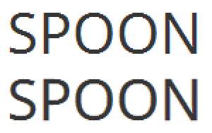
Notice how the bottom version is just a little bit softer around the edges. You can adjust the pixel value to taste, but don’t jack it up too high or your text will look really bold. Also, I recommend only applying this style to larger text. The tiny amount of added boldness fares better on larger text than smaller text, which is fine, because larger text is where the issue is anyway. Smaller text tends to be alright thanks to font hinting.