This tutorial will walk you through the concept of iconification — taking content on a page and applying CSS to transform it into a simplified, icon-sized preview of itself.
Let’s dig into an example. This demo shows iconifying applied to calendars. Click on the month icons to expand them.
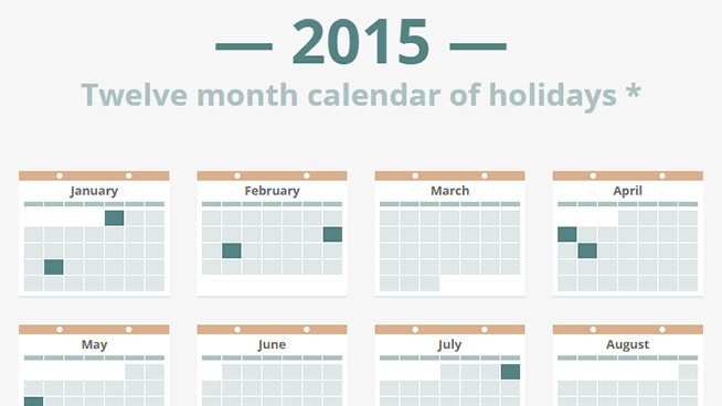
Visual Abstraction
In the calendar example, the icon view uses simple colored squares to indicate that a month contains dates of interest. Each icon can be clicked to trigger the full view with more details, such as date numbers and names of holidays. The smooth transition between the two maintains context, so the relationship is very intuitive.
This is where iconification really shines. It’s great for presenting a compact overview of content while still having the details available in an instant. In other words, it allows for visual abstraction of information.
The HTML
Here’s the HTML for a single month.
<article tabindex="0">
  <div class="outline"></div>
  <div class="dismiss"></div>
  <div class="binding"></div>
  <h1>January</h1>
  <table>
    <thead>
      <tr>
        <th>Sun</th>
        <th>Mon</th>
        <th>Tue</th>
        <th>Wed</th>
        <th>Thu</th>
        <th>Fri</th>
        <th>Sat</th>
      </tr>
    </thead>
    <tr>
      <td></td>
      <td></td>
      <td></td>
      <td></td>
      <td class="is-holiday">
        <div class="day">1</div>
        <div class="holiday">New Year's Day</div>
      </td>
      <td><div class="day">2</div></td>
      <td><div class="day">3</div></td>
    </tr>
    <tr>
      <td><div class="day">4</div></td>
      <td><div class="day">5</div></td>
      <td><div class="day">6</div></td>
      <td><div class="day">7</div></td>
      <td><div class="day">8</div></td>
      <td><div class="day">9</div></td>
      <td><div class="day">10</div></td>
    </tr>
    <tr>
      <td><div class="day">11</div></td>
      <td><div class="day">12</div></td>
      <td><div class="day">13</div></td>
      <td><div class="day">14</div></td>
      <td><div class="day">15</div></td>
      <td><div class="day">16</div></td>
      <td><div class="day">17</div></td>
    </tr>
    <tr>
      <td><div class="day">18</div></td>
      <td class="is-holiday">
        <div class="day">19</div>
        <div class="holiday">MLK Day</div>
      </td>
      <td><div class="day">20</div></td>
      <td><div class="day">21</div></td>
      <td><div class="day">22</div></td>
      <td><div class="day">23</div></td>
      <td><div class="day">24</div></td>
    </tr>
    <tr>
      <td><div class="day">25</div></td>
      <td><div class="day">26</div></td>
      <td><div class="day">27</div></td>
      <td><div class="day">28</div></td>
      <td><div class="day">29</div></td>
      <td><div class="day">30</div></td>
      <td><div class="day">31</div></td>
    </tr>
  </table>
</article>
No surprises there. Calendars are really just days organized in a tabular format, so <table> is the obvious semantic choice. Each month is wrapped in an <article> to convey that it’s a self-contained piece of content. Every <article> has tabindex="0" on it to enable tabbing, which is important for keyboard accessibility (more on this later).
The CSS
There’s a lot of CSS, so I’ll just cover the highlights. The full CSS is available in the source and includes comments for a couple of browser-specific fixes.
Each <article> is centered within an <li>, which is positioned within a <ul>. The centering technique I use on <article> allows it to overlap surrounding content and stay centered when expanded to full-size. Relevant declarations are shown below.
article {
  position: absolute;
  top: 50%;
  left: 50%;
  transform: translate(-50%, -50%) scale(.25);

  /* and more... */
}
Notice the transform property also has scale(.25) on it. This isn’t for centering, rather it’s what creates the 1/4th icon sizing.
Restoring <article> to full-size is done by adding the active class to its parent, causing the transform property on <article> to change.
transform: translate(-50%, -50%) scale(1);scale(1) is self-explanatory, but it’s worth noting that translate(-50%, -50%) needs to be restated, otherwise <article> will shift back to its non-centered position.
At the same time, the inactive class is added to sibling elements so that another <article> cannot be expanded until the active <article> is dismissed. This is done by blocking pointer events.
.inactive {
  pointer-events: none;
}
z-index stacking requires some finesse. The active <article> needs to appear above neighboring content. This means increasing the z-index when the expanding animation starts (easy part) and not resetting the z-index until the shrinking animation ends (tricky part). Fortunately, z-index is animatable, so we can use transition-delay to make this happen.
li {
  position: relative;
  z-index: 1;
  transition: z-index;
  transition-delay: .4s; /* delay when going from full-size to icon */

  /* and more... */
}

.active {
  z-index: 2;
  transition-delay: 0s; /* no delay when going from icon to full-size */
}
The active class also triggers opacity changes on various child elements, giving us that nice fade in/out effect on the details.
Of course, none of this would be animated without the transition declarations on <article> (for scaling) and the various child elements (for fading).
Pixel Perfection
Achieving pixel perfection with transformed elements — before, during, and after animation — takes patience. There are many quirks to battle, but fortunately, there are a few tricks and best practices that help.
All pixel sizes in the CSS are multiples of 4. This is no coincidence. The content is scaled to 1/4th size when displayed as an icon, so using multiples of 4 ensures that fractional pixel sizes don’t happen. This keeps pixels perfectly aligned and edges crisp.
Defining the widths and heights of elements can help. Not only does this make it easier to achieve the pixel alignment just discussed, but it can also prevent post-animation jiggles. Browsers will often readjust text when an animation ends. If an element containing such text doesn’t have a set width/height, then it’ll resize accordingly, causing a chain reaction of positional shifting to elements after it.
Performance
Iconifying content naturally involves a lot of elements in a small space. With so many elements to animate, it’s important to keep performance in mind, otherwise you’ll end up with a poor framerate and ragged transitions.
There are two things you should avoid: repaints and reflows. Repaints are caused by animating properties that force your browser to redraw elements. This includes color, background, box-shadow, and more. Reflows are caused by animating properties that force your browser to update the layout of elements. This includes width, height, margin, top, left, and more.
Repaints and reflows aren’t the end of the world, but they can hurt performance. You can avoid these by sticking with two properties that are very efficient to animate because they get help from the GPU: opacity and transform (when used for position, rotation, or scale).
This explains some of the decisions made in the CSS. There are places where animating color or background-color would be more intuitive, but opting for an approach that uses opacity allows for better performance.
JavaScript and Accessibility
JavaScript is used to handle the behavior of expanding and shrinking content. Mouse clicks are the obvious trigger, but keyboard accessibility is also important, so the JavaScript covers that as well. jQuery is used for convenience.
function activate(e) {
  var $wrapper = $(e.currentTarget).parent();
  $wrapper
    .addClass('active')
    .siblings().addClass('inactive');
}

function dismiss(e) {
  var $wrapper = $(e.currentTarget).closest('li');
  $wrapper
    .removeClass('active')
    .siblings().removeClass('inactive');
  e.stopPropagation();
}

function checkKey(e) {
  var $wrapper = $(e.currentTarget).parent();
  var isActive = $wrapper.hasClass('active');
  if (isActive && (e.keyCode === 13 || e.keyCode === 27)) {
    // active and hit enter or escape
    dismiss(e);
  } else if (!isActive && e.keyCode === 13) {
    // not active and hit enter
    activate(e);
  }
}

$('article').on({
  'click': activate,
  'blur': dismiss,
  'keyup': checkKey
});
$('.dismiss').on('click', dismiss);
Clicking/tapping an <article> calls activate(), which applies the active class to the appropriate element and the inactive class to the others.
Clicking the dismiss icon or tabbing/clicking away from an <article> calls dismiss(), which simply removes the active and inactive classes.
checkKey() brings support for certain key presses. Hitting enter will toggle the current <article>. Hitting escape will dismiss the current <article>, if it’s expanded.
That wraps up my first example. You can check out the finished demo, in case you missed it earlier.
Second Demo
Next up is a concept for iconifying profile cards. Go ahead and check out the demo.
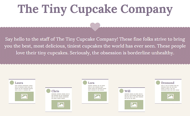
A lot of techniques from the first demo are reused here. The new point of interest is in turning the individual words in the profile text into abstract blocks. The first step to accomplishing this is to wrap each word in its own <span> tag so that we have something to work with. This would be really tedious by hand, so let’s have JavaScript do the work for us.
$('.about p').each(function() {
  var $this = $(this);
  var words = $this.text().trim().split(' ');
  var spans = '<span>' + words.join('</span> <span>') + '</span>';
  $this.html(spans);
});
That snippet simply grabs text within <p> tags, breaks it apart wherever it sees a space, then wraps each piece with <span> tags. Now we can use those <span> tags to apply some CSS.
.about span {
  position: relative;
  overflow: hidden;
}

.about span::after {
  content: '';
  opacity: 1;
  display: block;
  position: absolute;
  top: -2px;
  bottom: -2px;
  left: 0;
  right: 0;
  background-image: linear-gradient(to bottom, #fff 25%, #c7c5bf 25%, #c7c5bf 75%, #fff 75%);
  transition: opacity .4s;
}
The actual <span> tag is mostly left alone. Instead, an ::after pseudo-element is used to cover each word with a block of color. The top and bottom properties are given slightly negative values in order to stretch the block to cover letters that stand tall or hang low (“g”, for example).
Sadly, this makes the blocks a bit thick, which isn’t as visually appealing. The solution is to use a carefully crafted linear gradient that pads the top and bottom with white (to match the background). The blocks appear thinner, the text is still covered, everyone is happy.
Be careful though, this “spanifying” technique should be used in moderation. It’s very easy to get carried away and blow up your DOM tree with way too many <span> elements, each one being animated, which can lead to performance issues. It’s best to stick with small blurbs of text, like in the example.
Third Demo
My final demo shows iconification in the context of an analytics dashboard.
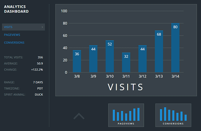
This demo has a lot going on, but doesn’t really introduce any new techniques for iconifying content, so I’ll leave it at that. If you want to see all the glorious details, the source is all yours.
Conclusion
I can see iconification being used in many other situations beyond the 3 I’ve shared here. It’s a great tool to help with visual abstraction and information hierarchy. There’s also a sort of slick elegance in being able to show a true icon-sized preview of real content by applying a coat of CSS to the content itself. Just be mindful to keep your pixels sharp and don’t forget about performance.