Coder’s Block v4 was my first full responsive web design project. The concept and basic mechanics of making a site responsive are simple enough, though a lot of my expectations and assumptions changed during the project. Responsive web design is definitely an art, and I have certainly not mastered it in one try. That said, I wanted to write about my experience and what I learned from it.
I’ve mentioned responsive web design before (here and here). I won’t rehash an introduction, but if you’re new to the subject, then I highly recommend the obligatory article over at A List Apart.
For visual context, here’s a single page from Coder’s Block v4 as viewed in mobile-sized, tablet-sized, and desktop-sized windows:
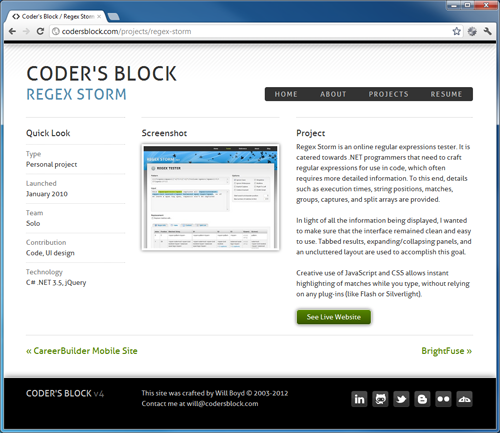
Notice how all three show the same content, but with differing layouts that are appropriate for the space available? Hooray for responsive web design! Alright, moving on…
Mobile-First or Desktop-First?
Responsive web design depends on CSS media queries to dynamically apply styles as the viewport changes. For example, as in the screenshots above, your page might be a single column layout in a smaller viewport (mobile), but become a 3 column layout in a larger viewport (desktop).
There are two ways to approach this: mobile-first and desktop-first. With mobile-first, you start with your mobile layout and then add styles to it when the viewport gets bigger and needs to be filled out more. This is done using min-width in your media queries to specify the pixel-width “breakpoints” that trigger the additional styles.
Here’s an example that makes header text bigger once the viewport is at least 640px wide:
h1 { font-size: 2em; }

@media only screen and (min-width: 640px)
{
  h1 { font-size: 3em; }
}
Desktop-first is just the opposite and uses max-width to specify breakpoints as the viewport shrinks and the layout needs to be reduced.
I started with desktop-first because I already had a desktop layout in mind. Some would say this is wrong, that mobile-first is better because it forces you to distill the layout and focus on what’s important in it. I don’t necessarily disagree. I did end up switching to mobile-first, but for a different reason: the CSS. Conceptually, adding CSS to increase a layout made more sense to me than adding CSS to reduce a layout.
No Universal Breakpoints
I originally decided on three nice, round, mathematically significant widths to serve as my breakpoints: 320px, 640px, 960px. I then tried to force all responsive style changes into only those three breakpoints. That simply didn’t work. What I learned is that the breakpoints you choose depend very much on your particular layout. Don’t be afraid to use whatever numbers you need.
The Full Spectrum
Another fallacy is to fixate on pleasing very specific viewport sizes. This is very much against the spirit of responsive web design. Your site should look good on the full spectrum of pixel widths, not just the ones that line up with popular Apple products. Furthermore, you may find a stray scrollbar throwing off your carefully chosen breakpoint, but if you have the full spectrum covered, your site will still look good despite that unexpected -20px.
Prepare for Math
I used a percentage-based 12 column grid layout, as many people would recommend. The 960 grid system didn’t quite have the column to gutter ratio I wanted (I wanted bigger gutters) so I crafted my own numbers. On top of that, I also had some places with nested columns, which meant accounting for multiplicative percentage width divs. All of this to say… There was an unbelievable amount of math involved. Here’s a screenshot of the Excel spreadsheet I created to get all the numbers right:

I don’t feel like reliving all that math here, so I won’t go into detail. But maybe one day I’ll share the spreadsheet (and its formulas) that I came up with, as I found it incredibly helpful.
Not Everything Scales
Going into this, I had the impression that pixel measurements were absolutely forbidden. Every width had to be a percentage so it could scale with the viewport. Well, I ultimately decided that this wasn’t the best advice. Things like mini-icons, single pixel borders, and some spots of padding looked best at fixed values, regardless of the viewport size. It’s all about good judgement.
It’s Fun!
When all the pieces fall into place, and your sites renders beautifully on any device, you feel like a wizard. Making a layout responsive is definitely harder. It feels like you’re playing with multi-dimensional CSS. But the payoff is very nice indeed.