I haven’t been this excited about a new browser tech in a long time.
Houdini is an ambitious project to give developers more power over CSS than we’ve ever had before. The first piece of this project to emerge is the CSS Paint API. This article will explain why Houdini is so exciting, then show you how to get started with the Paint API.
The Classic Disappointment
How many times have you heard about a killer new CSS feature and thought:
“Wow, that’s awesome! Can’t wait to use it… in 2 years, when browsers actually support it.”
Sometimes we don’t want to wait, so we turn to CSS polyfills. But these are often complex beasts behind the scenes, trying to emulate every nuance of the feature being polyfilled. This leads to a lot of potential for edge case bugs. There are also performance implications, as a polyfill’s JavaScript is unable to compete with the efficiency of a browser’s native implementation.
If you need more convincing, check out the dark side of polyfilling CSS.
A New Hope
So that’s mildly depressing, but what if I told you that one day, you’ll hear about a new CSS feature and think:
“Wow, that’s awesome! Can’t wait to use it… right now!”
This is what Houdini is striving to deliver. Houdini, in the spirit of the Extensible Web Manifesto, gives developers direct access to the browser’s CSS engine. This gives developers the power to create their own custom CSS features that run efficiently within the browser’s native rendering pipeline.
These custom CSS features are defined in worklets, which are just JavaScript files that you deploy to your website like any other JavaScript file (they execute differently, but we’ll talk more about that later). Then anyone that visits your site will be able to see the custom CSS feature, just as if it was built into their browser.
This means that new CSS features can be implemented via Houdini long before browser vendors implement them. Or you can scratch your own itches by making CSS features that you want, but browser vendors would never implement.
Browser Support
The good news is that Houdini is backed by Apple, Google, Microsoft, Mozilla, and Opera. The bad news is that only Google’s Chrome has implemented anything so far. Here’s the browser support chart at the time of writing.
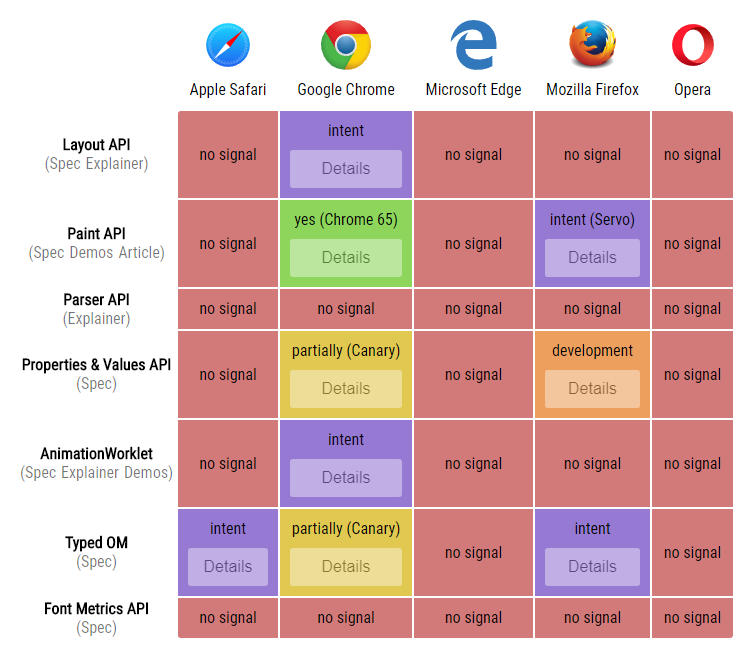
Update: Houdini continues to progress, so be sure to check the updated chart to see where things stand with various browsers.
That chart throws a lot at you, so let me explain.
Houdini is a collection of APIs that are different pieces of the puzzle, so to speak. The Layout API lets you control how elements are laid out with CSS, the Parser API lets you augment how CSS expressions are parsed, and so forth. As you can see, Houdini is very much a work in progress.
But there’s one Houdini API that you can start playing with today: the CSS Paint API. This API lets you draw images for use with CSS properties that expect them — for example, background-image and list-style-image.
For now, you’ll need Chrome to play with the Paint API. It’s enabled by default in the latest version of Chrome. If you’re using a version earlier than Chrome 65 (Android phone perhaps?) then the Paint API is still behind a flag — go to chrome://flags and enable Experimental Web Platform features.
To check for Paint API support via JavaScript, use this.
if ('paintWorklet' in CSS) {
  // good to go!
}
And to check via CSS, use this.
@supports (background: paint(id)) {
  /* good to go! */
}
The demo below uses both methods to check if your browser supports the Paint API. If you see double checkmarks, then you’re good to go!
Technical Notes
An important caveat is that the Paint API only works over https or on localhost. If you’re developing locally, http-server makes it super easy to view your pages on localhost.
Worklets (which we’ll talk more about in a minute) are cached by your browser, so be sure to disable the cache to see code updates take effect.
Also know that you can’t set breakpoints or use the debugger statement with code inside of a worklet (yet). Thankfully, you can still use console.log().
A Simple Paint Worklet
Let’s make something with the Paint API! We’ll start with something simple that draws an X across an element. We can use this to make placeholder boxes, commonly seen in mockups/wireframes to represent where images will go. Here’s the demo.
The drawing code goes into a paint worklet, which lives in its own JavaScript file. Paint worklets have limited scope and functionality. They can’t access the DOM and many global functions (like setInterval) are not available. This helps keep them efficient and potentially multi-threadable (not done yet, but it’s on the wishlist).
class PlaceholderBoxPainter {
  paint(ctx, size) {
    ctx.lineWidth = 2;
    ctx.strokeStyle = '#666';

    // draw line from top left to bottom right
    ctx.beginPath();
    ctx.moveTo(0, 0);
    ctx.lineTo(size.width, size.height);
    ctx.stroke();

    // draw line from top right to bottom left
    ctx.beginPath();
    ctx.moveTo(size.width, 0);
    ctx.lineTo(0, size.height);
    ctx.stroke();
  }
}

registerPaint('placeholder-box', PlaceholderBoxPainter);
The paint() function is called whenever the element needs to be (re)painted. It gives us a couple incoming parameters to work with. ctx is the object we draw on, just like a CanvasRenderingContext2D object (documentation here) but with some limitations (like no text drawing). size gives us the width and height of the element being painted.
Next, we tell the page about our paint worklet. Let’s also add a <div> with a class of placeholder while we’re here.
<script>
  CSS.paintWorklet.addModule('worklet.js');
</script>

<div class="placeholder"></div>
Finally, we connect the paint worklet to the <div> with some modest CSS.
.placeholder {
  background-image: paint(placeholder-box);

  /* other styles as needed... */
}
And that’s it. Congratulations, you’re using the Paint API!
Using Input Properties
As it stands now, our little paint worklet hardcodes the thickness and color of the X. Wouldn’t it be nice if it automatically used the thickness and color of the element’s border?
We can accomplish this with input properties, provided by the Typed Object Model (or Typed OM). It’s another part of Houdini, but unlike the Paint API, it’s still behind a flag. Enable it by going to chrome://flags and enabling Experimental Web Platform features.
You can check for Typed OM support in code with this.
if ('CSSUnitValue' in window) {
  // good to go!
}
Now let’s update the code for our paint worklet.
class PlaceholderBoxPropsPainter {
  static get inputProperties() {
    return ['border-top-width', 'border-top-color'];
  }

  paint(ctx, size, props) {
    // default values
    ctx.lineWidth = 2;
    ctx.strokeStyle = '#666';

    // set line width to top border width (if exists)
    let borderTopWidthProp = props.get('border-top-width');
    if (borderTopWidthProp) {
      ctx.lineWidth = borderTopWidthProp.value;
    }

    // set stroke style to top border color (if exists)
    let borderTopColorProp = props.get('border-top-color');
    if (borderTopColorProp) {
      ctx.strokeStyle = borderTopColorProp.toString();
    }

    // same drawing code as before goes here...
  }
}

registerPaint('placeholder-box-props', PlaceholderBoxPropsPainter);
We’ve added inputProperties to tell the paint worklet which CSS properties to look for. After that, the paint() function can use a third incoming parameter, props, to access the values for these properties. And now our placeholder boxes are a little smarter.
It’s fine to use border in our CSS, but keep in mind that it’s actually shorthand for 12 different CSS properties.
.shorthand {
  border: 1px solid blue;
}

.expanded {
  border-top-width: 1px;
  border-right-width: 1px;
  border-bottom-width: 1px;
  border-left-width: 1px;
  border-top-style: solid;
  border-right-style: solid;
  border-bottom-style: solid;
  border-left-style: solid;
  border-top-color: blue;
  border-right-color: blue;
  border-bottom-color: blue;
  border-left-color: blue;
}
The paint worklet needs us to be specific, so for the purposes of this demo, we use border-top-width and border-top-color.
Something cool to note is that border-top-width is converted to pixels as it’s passed into the paint worklet. This is perfect, since that’s the unit of measurement that ctx.lineWidth expects. As proof, the third placeholder box in the demo above has a border-top-width of 1rem, but the paint worklet is given 16px.
Crafting a Jagged Edge
For our next trick, we’ll make a paint worklet that draws a jagged edge. Here’s the demo.
And here’s the code for the paint worklet.
class JaggedEdgePainter {
  static get inputProperties() {
    return ['--tooth-width', '--tooth-height'];
  }

  paint(ctx, size, props) {
    let toothWidth = props.get('--tooth-width').value;
    let toothHeight = props.get('--tooth-height').value;

    // lots of math to ensure teeth are collectively centered
    let spaceBeforeCenterTooth = (size.width - toothWidth) / 2;
    let teethBeforeCenterTooth = Math.ceil(spaceBeforeCenterTooth / toothWidth);
    let totalTeeth = teethBeforeCenterTooth * 2 + 1;
    let startX = spaceBeforeCenterTooth - teethBeforeCenterTooth * toothWidth;

    // start drawing teeth from left
    ctx.beginPath();
    ctx.moveTo(startX, toothHeight);

    // draw the top zig-zag for all the teeth
    for (let i = 0; i < totalTeeth; i++) {
      let x = startX + toothWidth * i;
      ctx.lineTo(x + toothWidth / 2, 0);
      ctx.lineTo(x + toothWidth, toothHeight);
    }

    // surround the area below the teeth and fill it all in
    ctx.lineTo(size.width, size.height);
    ctx.lineTo(0, size.height);
    ctx.closePath();
    ctx.fill();
  }
}

registerPaint('jagged-edge', JaggedEdgePainter);
We’re using inputProperties again, this time to control the width and height of each “tooth”. But notice that --tooth-width and --tooth-height are custom properties (also known as CSS variables). This often makes more sense than hijacking an existing CSS property, but it does require another step.
You see, the browser knows that certain built-in CSS properties are length values (like with border-top-width from earlier). But a custom property can be used for all sorts of stuff. Your browser can’t assume a custom property is being used for length, so we have to tell it.
The Properties and Values API lets us do just that. It’s yet another piece of Houdini and also requires the Experimental Web Platform features flag be enabled at chrome://flags.
You can check for Properties and Values API support in code with this.
if ('registerProperty' in CSS) {
  // good to go!
}
Once enabled, we can add the following JavaScript (outside of the paint worklet file).
CSS.registerProperty({
  name: '--tooth-width',
  syntax: '<length>',
  initialValue: '40px',
  inherits: false
});
CSS.registerProperty({
  name: '--tooth-height',
  syntax: '<length>',
  initialValue: '20px',
  inherits: false
});
Now we can use all sorts of length values with --tooth-width and --tooth-height and your browser will understand them and convert them to pixel values for our paint worklet. We can even use calc() expressions. Crazy! And if we forget to set them or give them invalid length values, they’ll just fall back to initialValue.
.jagged {
  background: paint(jagged-edge);

  /* other styles as needed... */
}

.slot:nth-child(1) .jagged {
  --tooth-width: 50px;
  --tooth-height: 25px;
}

.slot:nth-child(2) .jagged {
  --tooth-width: 2rem;
  --tooth-height: 3rem;
}

.slot:nth-child(3) .jagged {
  --tooth-width: calc(33vw - 31px);
  --tooth-height: 2em;
}
<length> isn’t the only syntax allowed, as you can see here. So we could also register a --tooth-color property of syntax <color>, but I have something better in mind. By using -webkit-mask-image with our paint worklet, we can “knockout” the jagged edge shape with whatever background we want. The CSS looks like this.
.jagged {
  --tooth-width: 80px;
  --tooth-height: 30px;
  -webkit-mask-image: paint(jagged-edge);

  /* other styles as needed... */
}

.slot:nth-child(1) .jagged {
  background-image: linear-gradient(to right, #22c1c3, #fdbb2d);
}

.slot:nth-child(2) .jagged {
  /* pixel art from Iconoclasts, fun game! http://www.playiconoclasts.com/ */
  background-image: url('iconoclasts.png');
  background-size: cover;
  background-position: 50% 0;
}
The paint worklet code is exactly the same. Now check out our new fancy jagged edges.
Input Arguments
You can also pass values into your paint worklet by using input arguments. These allow you to specify arguments in CSS like so.
.solid {
  background-image: paint(solid-color, #c0eb75);

  /* other styles as needed... */
}
The paint worklet declares what it expects via inputArguments. Then the paint() function can grab those arguments from a fourth incoming parameter, an array named args as seen below.
class SolidColorPainter {
  static get inputArguments() {
    return ['<color>'];
  }

  paint(ctx, size, props, args) {
    ctx.fillStyle = args[0].toString();
    ctx.fillRect(0, 0, size.width, size.height);
  }
}

registerPaint('solid-color', SolidColorPainter);
I’m honestly not a fan of input arguments. Custom properties are a lot more versatile. They also help create better self-documenting CSS, since you can use descriptive property names.
New Ways to Animate
Let’s do one last project. Using familiar concepts we’ve already covered, we can create this nifty fading polka dot pattern.
We start by registering some custom properties to control the polka dots.
CSS.registerProperty({
  name: '--dot-spacing',
  syntax: '<length>',
  initialValue: '20px',
  inherits: false
});
CSS.registerProperty({
  name: '--dot-fade-offset',
  syntax: '<percentage>',
  initialValue: '0%',
  inherits: false
});
CSS.registerProperty({
  name: '--dot-color',
  syntax: '<color>',
  initialValue: '#fff',
  inherits: false
});
Then our paint worklet can use these custom properties, along with a bunch of math, to draw the polka dot pattern.
class PolkaDotFadePainter {
  static get inputProperties() {
    return ['--dot-spacing', '--dot-fade-offset', '--dot-color'];
  }

  paint(ctx, size, props) {
    let spacing = props.get('--dot-spacing').value;
    let fadeOffset = props.get('--dot-fade-offset').value;
    let color = props.get('--dot-color').toString();

    ctx.fillStyle = color;
    for (let y = 0; y < size.height + spacing; y += spacing) {
      for (let x = 0; x < size.width + spacing; x += spacing * 2) {
        // every other row shifts x to create staggered dots
        let staggerX = x + ((y / spacing) % 2 === 1 ? spacing : 0);

        // calculate dot radius based on horizontal position and fade offset
        let fadeRelativeX = staggerX - size.width * fadeOffset / 100;
        let radius = spacing * Math.max(Math.min(1 - fadeRelativeX / size.width, 1), 0);

        // draw dot
        ctx.beginPath();
        ctx.arc(staggerX, y, radius, 0, 2 * Math.PI);
        ctx.fill();
      }
    }
  }
}

registerPaint('polka-dot-fade', PolkaDotFadePainter);
Lastly, here’s the CSS that sets the custom properties and references the paint worklet.
.polka-dot {
  --dot-spacing: 20px;
  --dot-fade-offset: 0%;
  --dot-color: #40e0d0;
  background: paint(polka-dot-fade);

  /* other styles as needed... */
}
Now for a twist. We can animate the values of registered custom properties in CSS. As the values change, the paint worklet using them will be called upon to repaint with the updated values.
Let’s animate --dot-fade-offset and --dot-color via a keyframes animation (transition would work, too).
.polka-dot {
  --dot-spacing: 20px;
  --dot-fade-offset: 0%;
  --dot-color: #fc466b;
  background: paint(polka-dot-fade);

  /* other styles as needed... */
}

.polka-dot:hover, .polka-dot:focus {
  animation: pulse 2s ease-out 6 alternate;

  /* other styles as needed... */
}

@keyframes pulse {
  from {
    --dot-fade-offset: 0%;
    --dot-color: #fc466b;
  }
  to {
    --dot-fade-offset: 100%;
    --dot-color: #3f5efb;
  }
}
Hover/tap the demo below to see the animation in action.
The potential here is really exciting! We can use paint worklets with custom properties to create completely new types of animation.
Pros and Cons
Let’s review some of the good things about Houdini (and the CSS Paint API in particular).
- Gives you the freedom to create your own visual effects.
- Doesn’t rely on adding extra elements or pseudo-elements to the DOM.
- Executes as part of your browsers rendering pipeline for greater efficiency.
- More efficient and less buggy than polyfills.
- Provides an alternative to using complex/hacky CSS to achieve certain results.
- Serves as a method of abstraction and modularization by containing visual logic within a paint worklet.
- Lets you create completely new types of animation.
- Solves future browser support issues by allowing developers to use new features before browsers implement them.
- All five major browser vendors intend to support Houdini.
Of course, there are shortcomings as well.
- Large pieces of Houdini are still in development.
- Houdini itself requires good browser support before it can start alleviating future browser support issues.
- Browsers have to load a paint worklet file before being able to use it, which can cause style pop-in.
- Current dev tools do not support setting breakpoints or using the
debuggerstatement in a paint worklet (although you can still useconsole.log()).
Conclusion
Houdini has the potential to radically change how we approach CSS. It’s still a work in progress, but even just the few working parts we have so far are incredibly interesting. Keep an eye on Houdini.
All the demos from this article are available in this GitHub repo. For more demos, check out this awesome collection by @iamvdo.
Thanks for reading!