I like to center my CodePens, horizontally and vertically. I think it makes for better presentation than just letting things fall to the top left corner. Generally, it’s not hard to do, and there are several ways to do it.
The Problem
But there’s a wrinkle. A screenshot is auto-generated for every CodePen. This screenshot is used for lots of things:
- Twitter card images on tweets
- Cover images on Google+ posts
- In CodePen RSS feeds
- On the CodePen site when viewed on mobile devices
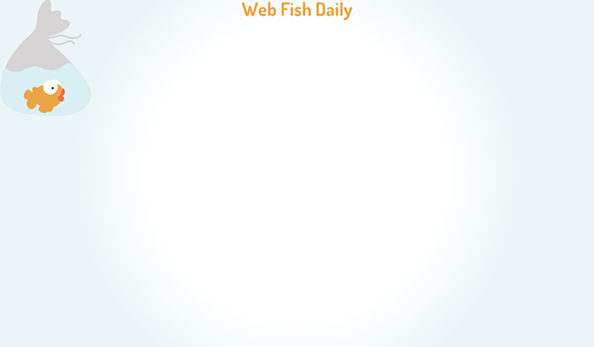
So imagine my disappointment when I create a nicely centered CodePen like this:
See the Pen Web Fish Daily by Will Boyd (@lonekorean) on CodePen.
And end up with a drunk screenshot like this:
The Solution
Obviously, whatever is making these screenshots (my guess is trained hamsters) isn’t perfect. So I did some testing for which methods for centering still hold up in the screenshots.
Let’s cut to the chase. This is the best method:
<div class="content"></div>.content {
position: absolute;
top: 50%;
left: 50%;
transform: translate(-50%, -50%);
}Here’s a sample CodePen using this method:
See the Pen Centering CodePen Screenshots by Will Boyd (@lonekorean) on CodePen.
And here’s its screenshot:

I’m not saying this is the only method that works for screenshots, but it is my favorite. For example, the table cell method also works, but requires an extra wrapper element and more CSS. Sadly, the flexbox method, though very nice and lightweight, doesn’t work.